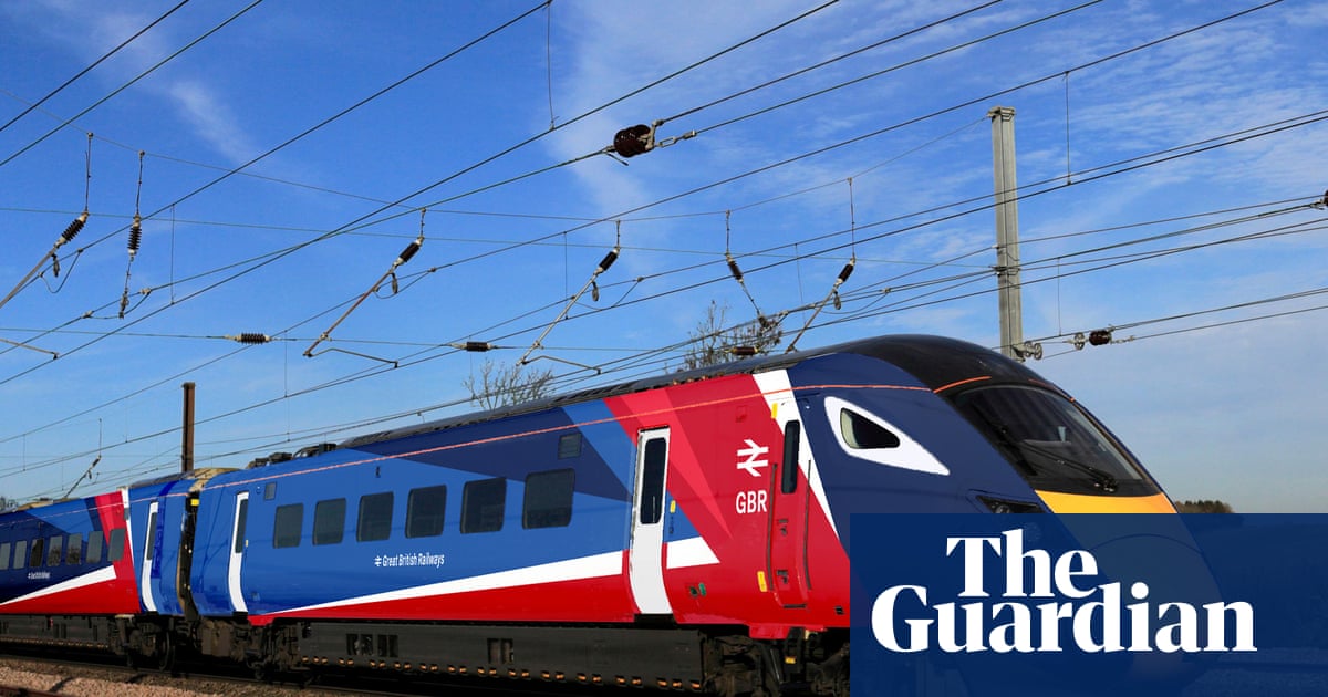
No matter how much train fares cost under Great British Railways, no one can accuse the government of wasting money on an expensive redesign.The logo, branding and livery for the impending renationalised and reformed railway will be unveiled by ministers at London Bridge on Tuesday. It is red, white and, yes, blue.The Department for Transport said passengers will get their “first look at the future” of Britain’s railways – a future that may ring a few bells. Designed in-house at the DfT, the logo is the GBR name in rail typeface accompanied by the double arrow symbol – what the DfT describes as a “nod to Britain’s proud railway heritage”, rather than a direct lift from British Rail.The first actual trains to be repainted could arrive from next spring, but fans of pretend ones can see the brand on a Hornby model and a virtual version in the Train Sim World 6 game at London Bridge, and on displays at other leading stations around the country.The unveiling comes as legislation aimed at reforming the railway is debated in the House of Commons on Tuesday. The government hopes the bill will create a unified, accountable nationalised railway after decades of a fragmented private system.The transport secretary, Heidi Alexander, said: “The future of Britain’s railways begins today. I’m immensely proud to unveil the new look for Great British Railways as we deliver landmark legislation to nationalise our trains and reform the railway so it better serves passengers.“This isn’t just a paint job – it represents a new railway, casting off the frustrations of the past and focused entirely on delivering a proper public service for passengers.“With fares frozen, a bold new look and fundamental reforms becoming law, we are building a railway Britain can rely on and be proud of.”The Department for Transport says the double arrow symbol is a ‘nod to Britain’s proud railway heritage’. Photograph: Department for TransportSeven of England’s former private train operators are already back in public hands, covering a third of all passenger journeys in Great Britain, with the rest due to renationalised by the end of 2027. The new GBR, to be headquartered in Derby, will bring track and train operations together, at arm’s length from the government, and a strengthened passenger watchdog will be set up to monitor service.The new brand design also features on the GBR ticketing app under development, which the government will roll out as a new one-stop shop for passengers to check on their journeys and to buy tickets for travel across the whole network, without any booking fees. The DfT said the GBR app would also simplify travel for disabled passengers, who will be able to book Passenger Assist services to board and disembark trains in the same app when buying tickets.skip past newsletter promotionafter newsletter promotionIn October, the design of the new Great British Railways station clock was unveiled, also at London Bridge.The new brand design will also feature on the GBR ticketing app. Photograph: Department for TransportAlex Robertson, the chief executive of the current independent watchdog Transport Focus, said: “As well as what is written into law, the success of GBR will depend on its people and culture, and today gives us a glimpse into what that could look and feel like.”A first big test for state-controlled services comes from next week when hundreds more LNER trains are added each week on a revamped east coast mainline timetable.Alexander announced last month that rail fares in England will be frozen in 2026 for the first time in 30 years.
SRCThe Guardian - World News
LANGEN
LEANCenter-Left
WORDS590
ENT4
MON · 2025-12-08 · 22:30 GMTBRIEF NSR-2025-1208-1614
NSR-2025-1208-1614News Report·EN·Political Strategy
Great British Railways flies the flag as logo goes back to the future
Great British Railways (GBR) unveiled its new logo and branding, a red, white, and blue design featuring the GBR name and a double arrow symbol reminiscent of British Rail. The unveiling coincides with the government's legislation to renationalize and reform the railway system.
Gwyn Topham Transport correspondentThe Guardian - World NewsFiled 2025-12-08 · 22:30 GMTLean · Center-LeftRead · 3 min
The Guardian - World NewsFIG 01
Reading time
3min
Word count
590words
Sources cited
1cited
Entities identified
4entities
Quality score
100%
§ 01
Briefing Summary
AI-generatedNEWSAR · AI
Great British Railways (GBR) unveiled its new logo and branding, a red, white, and blue design featuring the GBR name and a double arrow symbol reminiscent of British Rail. The unveiling coincides with the government's legislation to renationalize and reform the railway system. The GBR aims to unify track and train operations under a single, accountable nationalized entity, headquartered in Derby, after decades of private fragmentation. The first repainted trains are expected by next spring, with the brand also appearing on a new GBR ticketing app. The government aims to have all train operators renationalized by the end of 2027, with seven already under public control. A strengthened passenger watchdog will also be established to monitor service.
Confidence 0.90Sources 1Claims 5Entities 4
§ 02
Article analysis
Model · rule-basedFraming
Political Strategy
Economic Impact
Tone
Measured
AI-assessed
CalmNeutralAlarmist
Factuality
0.70 / 1.00
Factual
LowHigh
Sources cited
1
Limited
FewMany
§ 03
Key claims
5 extracted01
The DfT said the GBR app would also simplify travel for disabled passengers.
factualDepartment for Transport
Confidence
1.00
02
The rest (of the train operators) due to be renationalised by the end of 2027.
factual
Confidence
1.00
03
Seven of England’s former private train operators are already back in public hands, covering a third of all passenger journeys.
statistic
Confidence
1.00
04
The logo, branding and livery for Great British Railways will be unveiled by ministers at London Bridge on Tuesday.
factual
Confidence
1.00
05
The government hopes the bill will create a unified, accountable nationalised railway.
prediction
Confidence
0.80
§ 04
Full report
3 min read · 590 words§ 05
Entities
4 identifiedKey playerOppositionContextPositiveNeutralNegative
Organizations2
Locations1
§ 06
Keywords & salience
8 termsgreat british railways
1.00
railway renationalisation
0.90
railway reform
0.80
logo redesign
0.70
public service
0.60
department for transport
0.50
passenger experience
0.50
train operations
0.40
§ 07
Topic connections
Interactive graph No topic relationship data available yet. This graph will appear once topic relationships have been computed.