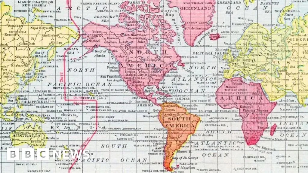
"He wanted a straight line to be drawn on a map to look like a straight line in reality if you followed a compass bearing," he told the BBC. "That was what it was intended to do, and that's what it does brilliantly well."To keep those angles correct on a flat map, Mercator had to stretch the grid lines wider as they moved away from the equator toward the poles.His map accommodates for the curvature of the Earth by making countries near the equator seem much smaller than they are, with countries nearer the poles appearing stretched.The distortion is a result of it being impossible to accurately represent the surface of a globe on a two-dimensional chart.More than 450 years on, Mercator's creation is still the basis for many of the maps we see in classrooms, on TV and online, including Google Maps.But critics of the Mercator map say there is a psychological effect to viewing some places as smaller than they actually are and others as larger, as we instinctively view bigger things as more important.For Kenyan geographer Kioko Muendo, this has implicitly downplayed Africa's vast resources, population and investment opportunities."Maps are more than just guides for travellers - they shape how regions are perceived politically and economically," he told the BBC.
SRCBBC News - World
LANGEN
LEANCenter
WORDS213
ENT6
SAT · 2026-09-05 · 13:46 GMTBRIEF NSR-2026-0905-109510
NSR-2026-0905-109510Analysis·EN·Economic Impact
What different world maps get right - and what they get wrong
The article discusses the inaccuracies of world maps, particularly the widely used Mercator projection. Created over 450 years ago, the Mercator map accurately represents compass bearings as straight lines but distorts the size of landmasses.
29 minutes agoShareSaveAdd as preferred on GoogleJaroslav LukivBBC News - WorldFiled 2026-09-05 · 13:46 GMTLean · CenterRead · 1 min
BBC News - WorldFIG 01
Reading time
1min
Word count
213words
Sources cited
2cited
Entities identified
6entities
Quality score
100%
§ 01
Briefing Summary
AI-generatedNEWSAR · AI
The article discusses the inaccuracies of world maps, particularly the widely used Mercator projection. Created over 450 years ago, the Mercator map accurately represents compass bearings as straight lines but distorts the size of landmasses. This projection makes countries near the equator appear smaller and those near the poles larger, a consequence of flattening a spherical Earth onto a two-dimensional surface. Critics argue this distortion can psychologically influence perceptions of importance, implicitly downplaying regions like Africa. The UN's adoption of a new map reflecting Africa's true size highlights the ongoing debate about how maps shape political and economic perceptions.
Confidence 0.90Sources 2Claims 5Entities 6
§ 02
Article analysis
Model · rule-basedFraming
Economic Impact
Political Strategy
Tone
Measured
AI-assessed
CalmNeutralAlarmist
Factuality
0.70 / 1.00
Factual
LowHigh
Sources cited
2
Limited
FewMany
§ 03
Key claims
5 extracted01
Maps shape how regions are perceived politically and economically, not just serving as travel guides.
quoteKioko Muendo
Confidence
1.00
02
Mercator's map is still the basis for many maps used in classrooms, on TV, and online, including Google Maps.
factual
Confidence
1.00
03
To maintain correct angles on a flat map, Mercator stretched grid lines wider towards the poles, making equatorial regions appear smaller and polar regions stretched.
factual
Confidence
1.00
04
Mercator's map was designed to show straight lines on a map as straight lines in reality when following a compass bearing.
quoteUnnamed source quoted by BBC
Confidence
1.00
05
Critics argue that viewing some places as smaller or larger than they are can have a psychological effect, influencing perceptions of importance.
factual
Confidence
0.90
§ 04
Full report
1 min read · 213 words§ 05
Entities
6 identifiedKey playerOppositionContextPositiveNeutralNegative
Organizations2
Locations1
§ 06
Keywords & salience
10 termsmercator map
1.00
world maps
1.00
map distortion
0.90
globe representation
0.80
two-dimensional chart
0.70
geographical perception
0.60
psychological effect
0.60
equator to poles
0.50
compass bearing
0.50
google maps
0.40
§ 07
Topic connections
Interactive graph Network visualization showing 8 related topics
View Full Graph Person Organization Location Event|Click node to navigate|Edge numbers = shared articles